I have decided to create a logo for my company that can be featured on all my productions and so my company can have a easily recognisable brand that people in the north east can easily associate with my magazine, billboard and website.
Tuesday, 28 November 2017
Tuesday, 17 October 2017
Suitable Images for events/Photography section
I have created a Powtoon on various images that I could potentially include on my magazine, billboard and website for the Photography/events section. The images are linked to various events that have occurred around the north east within the last year such as: Lumiere, Sunderland illuminations and Sundara karama gig. Although these events have already taken place they do a good job at promoting what kind of events are taking place.
Thursday, 12 October 2017
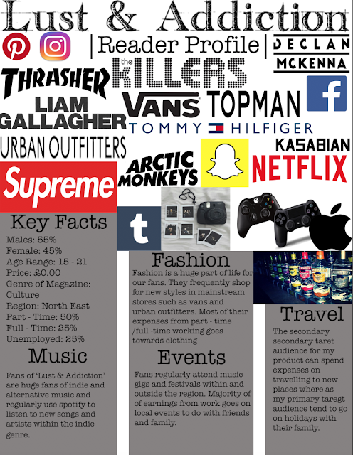
My Reader Profile

This is my completed readers profile. I have created it on Photoshop as I felt this was the most professional way to do so and therefore advertisers are more likely to take my magazine seriously. In regards to my audience, I have included the main facts and figures of who they are but have also gone into a bit of detail from a personal perspective including a summary of their likes and lifestyle. Not only does this help me to make sure all my products are linked back to audience interest, but it will also help companies that want to buy advertisement sections in my magazine. For example, my reader profile says they like streaming music on their mobiles therefore Spotify would be an ideal sponsor. In terms of design, I have followed the same colour scheme I am planning on using in my magazine and used a similar font also. I have arranged in in boxes which I think looks very neat and professional. I have included an image collage which I was inspired to do so by NME's reader profile as I feel this gives a visual aid to boost the facts.
Wednesday, 4 October 2017
Tuesday, 3 October 2017
Flat Plans for Website

1st page
Social media links - I have placed social media links above my masthead as I want them to be included for modern purposes of using social media to widen my audience but I don't want them to be a main focus as I want the main focus of my brand to be the website as it includes more detailed summary's of topics. These will remain the same style on each hyperlinked page.
Masthead - The masthead must be on my website a it is the only thing that links all my ain tasks and preliminary tasks together as they all feature the name of my company on. I have decide to place this at the top and bottom of the image gallery and will make sure that it will remain this way on each hyperlinked pages.
Image gallery - the image gallery will consist of various images of main story's from each of the sub genres. This has been placed the top of main page and will remain the same positon and images in each hyperlinked page so that people are aware that the images on the gallery are the main topics and this allows them to easily navigate to read the most important story's
Navigation links - The navigation links will remain at the top of the page in all hyperlinked pages and will all be links to different sub genre pages. I have done this so that people can easily find the genre that best suits there needs and easier to navigate around the website instead of cramping everything on the same page.
Dominant image - I have chose to have four dominant images on the homepage that will be similarly linked to different genres same as the image gallery but this time will feature different images and different story's that are associated with that sub genre. I have decided to do this so that it keeps readers interested and shows them other topics that are there for them to read without going onto the hyperlinked page.
heading /subheading - the heading and subheadings are all placed underneath the dominant images as the heading is the title of the article and the subheading gives a little more information about what the image I going to talk about. This will not be a full description but enough to keep my target audience intrigued.
2nd/3rd page
Heading (Fashion and Travel/photography ) - The headings are placed above all of the images to indicate that this is the sub genre the images are focusing on.
Sub Images - I have included several sub images on each hyperlinked page as I want my website to be more image led than text based as my target audience are more interested in images than discussions.
Flat Plans for Billboard
Logo - I have decided to place the company of the logo next to the masthead as a logo is commonly more rememberable than the name of a company and seeing them side by side will allow it to be more easily recognised.
Essential info -The essential info on a billboard simply consists of social media links. I have used this because my target audience are teenagers that use social media on a regular basis and having social media links allows them to instantly have more information on the company using their phone.
Strapline - I have placed the strapline at the side of the product as I want all my products to feature the strapline on them to show that they are all the same company's work.
Images - I have decided too use 5 images on my billboard as I want to advertise each sub genre that will be featured within my magazine. Each image will be something that is associated with the sub genre. Placing these images in the centre of the billboard will draw the most attention from my target audience as they are the first thing people will notice as they are more attracted to images rather than text.
Subhead - I have placed sub headings under the 5 images as I want them to highlight what each of the images link to in terms of sub genres.
Subscribe to:
Posts (Atom)